
Race for a family
Hey,
I’ve finally found an excuse to use the gganimate package in R to generate bar chart races! I’m going back to one of my previous jobs, demography, and we are going to look at how the fertility of the cohorts of Quebec women born between 1915 and 1980 has evolved.
The data
- Fertility data from Statistics Canada, year 1921-2016.
It includes data for all provinces.
The code
As usual, the code is on my github. It is heavily inspired by this blog post by Michael Toth
I will come back to these snippets for everything gganimate related. I also learned about the approx() function, which is used to interpolate the number of children for missing age values (such as 16.2, 16.4, 16.6, 16.8).
interpolate <- all_data %>%
  group_by(annee_de_naissance) %>%
  mutate(cumulatif_fecondite = approx(age, cumulatif_fecondite, age)$y) %>%
  ungroup()
Results
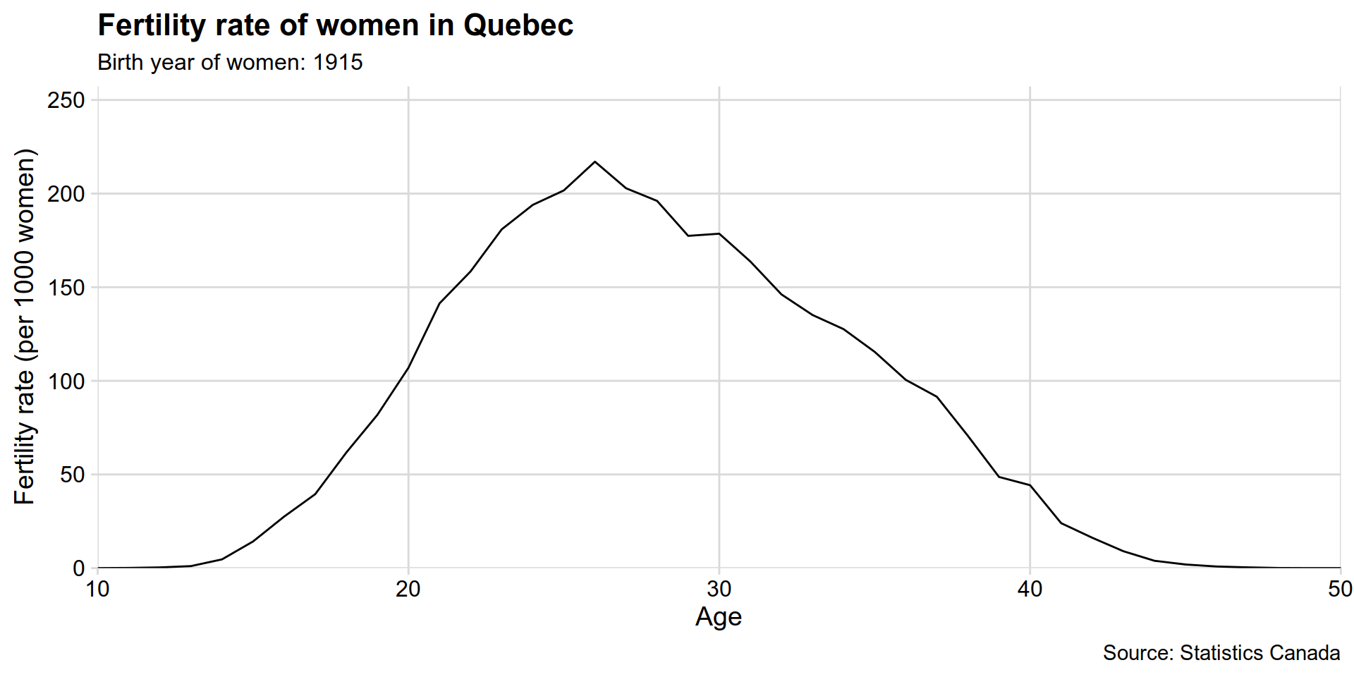
The first graph shows the fertility rate of each cohort of women born between 1915 and 1980 in Quebec. Peak fertility age first decreases between the 1915 and 1940 cohorts (mothers of baby boomers) then increases as fertility rates drop sharply.
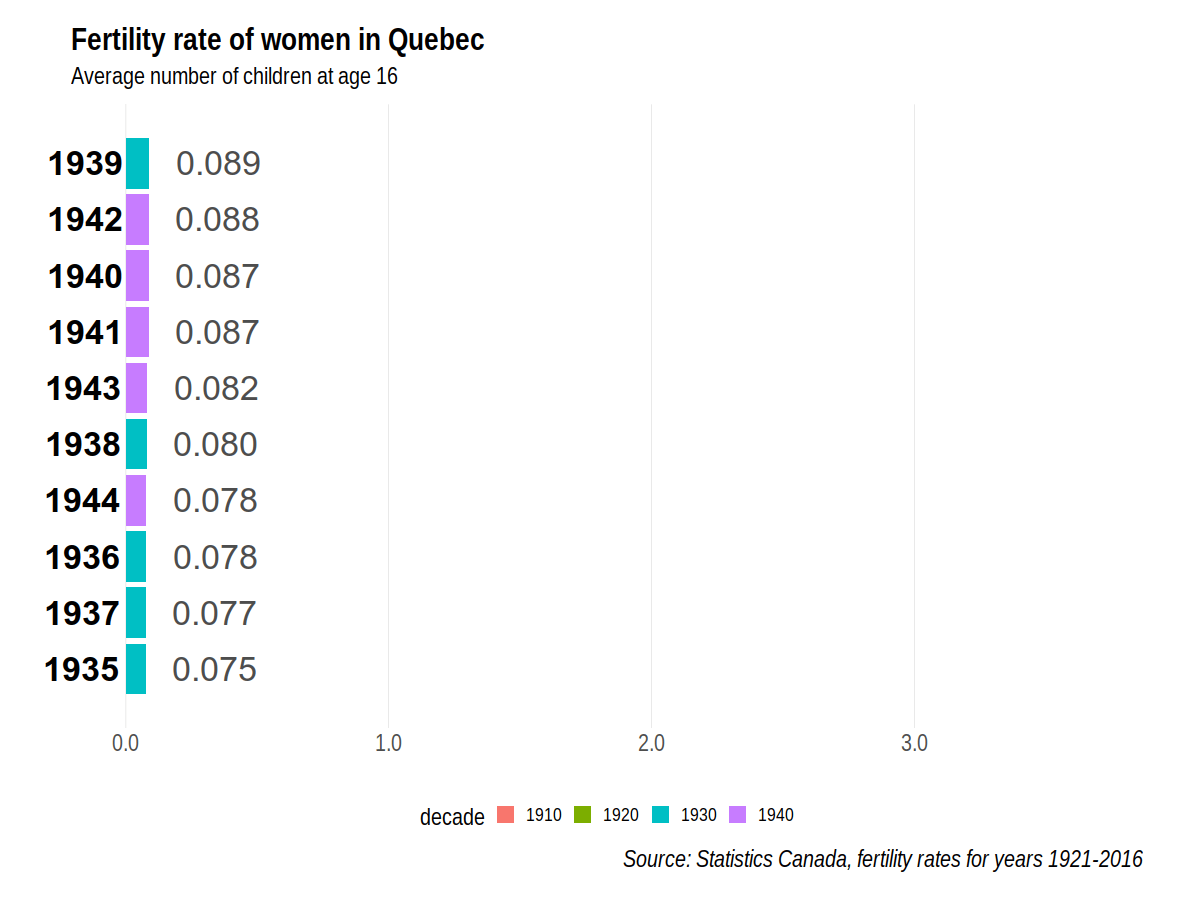
Now let’s try my first “bar chart race” to see who gets the largest family. Women born in the 1940’s have a pretty good start to their families, but they are then overtaken when they turn 20 by women born in the 1930s. As they turn 30 year old these women are then “passed” by women born in the 1920s. Women born in 1922 have the largest total fertility rate : 3.585 children on average. Slow but steady wins the race!
We can also render an mp4 video (less than 1MB) for sharing, because the gif above weighs about 20 MB.
Race all provinces!!